Kent Wiley

....in my pursuit of "not pretty" compositions...
publisher's note This from a man who states, "I'm still trying to wrestle my way out of the Full Nelson that pretty pictures have on my photography."
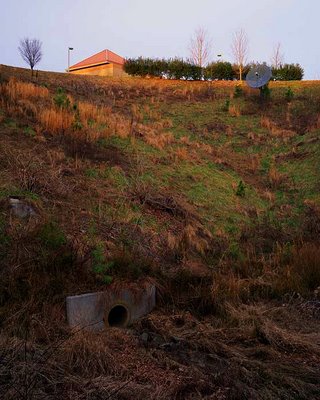
publisher's comment - I have a hard time seeing this as anything but the butt-hole discharge of affluent - or is that effluent? - America. Environmental degradation bathed in the warm folds of smug self-indulgence.
Of course, perhaps I am being unduly influenced by the wretched annual consumer bacchanal of "Black Friday".
In any event, I like it quite a bit, In fact, I would probably hang this photograph on my wall.


5 Comments:
While I can appreciate this for it's formal qualities, I can't help but feel a bit disconnected here. There's something under the surface that I just can't seem to put my finger on...slightly sinster perhaps. All this said, the "pursuit of not pretty compositions" is a road that seems to have different ends for most who choose to follow it. I think you're onto something here and I hope you keep pushing and developing your ideas.
When I found this location almost two years ago, I was really excited about it. I was at the time deep in a study of Jeff Wall's work, and so I think there is a strong influence from him here. But there is no judgement whatsoever concerning this landscape. I'm fascinated by the compositional elements. Thanks for your encouragement.
Kent,
You still have pretty light! There are some really nice compositional elements here and it really does work well that way. There is a formal quality here that really works. It may not be "pretty", but it really works well, to me, with that nice golden light.
I have a hard time seeing this as anything but the butt-hole discharge of affluent - or is that effluent? - America.
Environmental degradation bathed in the warm folds of smug self-indulgence.
Of course, perhaps I am being unduly influenced by the wretched consumer bacchanal of "Black Friday".
In any event, I like it quite a bit, In fact, I would probably hang this photograph on my wall.
Michelle, yeah there is still that desire to suck the viewer in through the traditional means of "sentimental" late afternoon light. Another attempt made a year later at this same location in the middle of the day and w/ a human subject is less interesting for a number of reasons, but primarily because it doesn't have this "lovely" light.
So we have here a moderately subversive subject presented in a traditional manner. It gives me ideas...Thanks Mark, in fact I do have this photo hanging on my wall.
Post a Comment
<< Home