Jim Jirka ~ Choaticism Continues

There are few times when I am out making an image, that a view just excites me when I see it on the ground glass. It is even more of an excitement when the vision continues into print form.
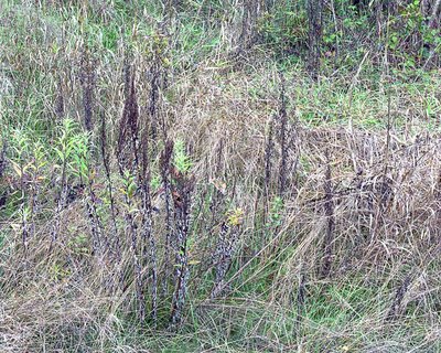
This is one such image. It is in my continuing body of work, depicting the explosion of chaotic detail, while still having a semblance of order.
Nuances of color and shape help define an almost camouflaged story.
Publisher's Comment The devil made me do it - I didn't seem to have any choice but to post this immediately following Timothy Atherton"s Immersive Landscape
FEATURED COMMENT #1: Michelle Parent wrote: "This shows exactly why you are drawn to Tim's! You and he are on the same wavelength! There's a painterly quality to your's that I like, but it may be the compression too. I really like that you use color here, because it is what helps define the basic shapes and areas in this. I am not sure it would be as strong in B&W. Very lovely! The dark spikes of goldenrod (?) really draw me in. There is a gentleness/tenderness here that I feel. A respect for the passing of the season. A quiet observation that YOU are NOTICING that these INDIVIDUAL lives are ending AT THIS MOMENT."
FEATURED COMMENT #2: Paul Raphaelson wrote: ""...I do think work of this kind is evidence of the importance of a body of work over an individual image. We are all drawn to this picture as a particularly nice example of a certain KIND of image that has become welcoming and familiar. But beyond certain surface details, we have no way of knowing what distinguishes Jim's vision from that of any number of other people.
This isn't a criticism of Jim or of this image; just an observation on the limitations of a single image in conveying what an artist cares about.
Picture #2 in this body of work could be almost identical to this one; it could be a picture of a suburban living room with a similar color scheme; it could the bloody legs of a corpse in the grass ...
All might be plausible, but the meaning of this image is greatly altered in each case."


4 Comments:
Jim,
This shows exactly why you are drawn to Tim's! You and he are on the same wavelength! There's a painterly quality to your's that I like, but it may be the compression too. I really like that you use color here, because it is what helps define the basic shapes and areas in this. I am not sure it would be as strong in B&W. Very lovely! The dark spikes of goldenrod (?) really draw me in. There is a gentleness/tenderness here that I feel. A respect for the passing of the season. A quiet observation that YOU are NOTICING that these INDIVIDUAL lives are ending AT THIS MOMENT.
Michelle,
I am still working on the part of expressing my feelings for certain images.
You described the image and your feelings well. Looks as though I still have a long way to go.
But it is my nature to be quiet and say very few words.
I love this colour photograph our work. I’m schizophrenic about B&W and colour (and see them as two very different things – and I personally think good colour is usually MUCH harder to do). I went back and forth with my urban landscape work for months doing both before settling on colour. It didn’t take so long with the boreal forest work, but I did do some in colour – a few worked, really well – but not enough of them. I found late Fall through winter into spring was good for colour, but summer green and Fall Yellow’s just defeated me… almost impossible NOT to make a picture postcard (though the same goes for snow on branches in B&W)…
BTW I think John Brownlow’s project is wonderful. I think we’ve fed off each other over the last year or two doing these (and I’ve had something of a hiatus the last year moving from the north to the south edge of the Boreal Forest and figuring out how to make sens of the change- but some new stuff is coming along.
tim a
Paul,
My website has a link here. You can see the previous parts to the body. It is still a work in progress. I have additional parts that I am working thru currently.
Thanks for the feedback.
Post a Comment
<< Home