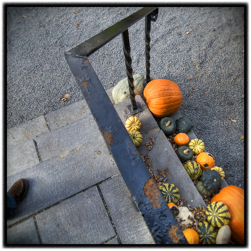
Friday, November 10, 2006

Just a quick note

As The Landscapist blog gains density and depth (thanks to one and all), I think you will find much interesting stuff buried in the Archives. IMO, it will be worth your time to explore a bit.

And, a note for all of the "lurkers" out there - my web stats track many repeat visitors from all over the planet - say "hello" and let me and the regulars know what you're thinking (especially all of you from the great continent "down under").

urban ku # 4


Do you ever feel the prick to explore landscapes other than the "natural" kind? Is the emphasis placed on the "pure" nature experience of the photographic kind a bit myopic? Is there an element of koyanasquatsi at play? I know that at least one of you out there - Mary Dennis - is scratching the itch to explore other landscapes.

Anyone else?

urban ku # 3


A lovely afternoon for a stroll in Old Montreal. It seemed that no matter which way you looked, something beckoned from around the corner, down the street, or in the air - glances, glimpses, and glimmers of curiosities all around.

Thursday, November 09, 2006

HDR Stab no.2


It struck me in a bit of a news flash in my head that a "delicately" created HDR/Tone Mapped photograph bears a striking resemblance to my all-time favorite photographic print medium of large-format, color-negative-generated C prints. Perhaps this epiphany (and the recent election results) heralds a new era - Happy days are here again - perhaps.

Joel Truckenbrod wrote, "...what do you think the deal is with all of the "plasticy" HDR work out there? Simple user incompetence? I'm not familiar with the controls available, so I'm unsure of where the pitfalls are in the process. Regardless, It's somehow strangely comforting to know that photographer is still important to the final result.

Also, what implications does this have on photographers today (in a more global sense)? I've certainly noticed a shift in accepted tonal aesthetics since the day's when Velvia ruled the calender club's world. It will be interesting to see what HDR is seen as in time, when the novelty of the idea wears away.
"

Quick Answer - The creation of an HDR, like image editing in any other software, is definitely governed by user input. In effect, it is another extension of the photographer's digital darkroom toolbox, and, like all tools, they can be used to create all manner of output for all manner of "taste".

Joel also wrote, "When HDR is simply used a tool to confront the limitations of the medium, I find myself embracing the idea..." At the moment, that sentiment pretty much reflects my idea on the subject.

The photograph published with this post is a great example of using HDR/Tone Mapping to create a result that was nye unto impossible using Photoshop alone. Without going too deep into technique - which we don't talk about here - the final image file was created by generating an HDR file from 4 files created from 1 RAW image file processed 4 times - one for deep shadow detail, one for highlight detail, etc. Then Tone Mapping was applied and it is with this step that the look of the final image was created.

Tom Gallione ~ Flaming Grasses


The fields of Indian grass at Pennypack Ecological Trust are set ablaze as the sun sets on Huntingdon Valley.

I have looked at this image numerous times and have waivered on my opinion of it, even when I was making the photograph I wasn't sure what was drawing me to it. The native aspect ratio is 35mm and it wasn't until I cropped it square that everything came together for me. I realize now that I am beginning to see more squarely, so to speak. Not sure if it is the Hobson effect or what...

Short of taping my mirror, anyone know of a way to convert a 35mm to see squarely in the field? I would prefer the square format to be part of the image making process in the field rather than an afterthought. Hopefully someday camera manufacturers will make the square format an in-camera option.

Wednesday, November 08, 2006

A quick stab at HDR and Tone Mapping


Can and HDR/Tone Mapped photograph still look like a photograph and not like a photograph that's pretending to be a painting? Quick answer - Yes.

After a little time messing around with Photomatix and some very tricky to process photographs, I can say that I am impressed with HDR's capabilities to produce a digital file with an amazing amount of dynamic range information. And it can do it without ending up with the heavy-handed look that is evident in a lot of HDR work that is currently surfacing.

IMO, it's definitely worth getting to know your way around HDR and Tone Mapping.

Joel Truckenbrod ~ A Man of Few Words


Fallen Pine, Near Cascade River, Minnesota.

Publisher's Note - I have a backlog of photograph submissions (a good thing). If you have submitted recently but not been published, keep the faith. At the moment, I am concentrating on "new faces", but I will definitely be getting back to the "regulars".

Please, keep the submissions coming. If I have to add a "gallery" thing to keep up, I'll figure out how to do it.

Larry Lynch ~ HDR and Tone Mapping


HDR There are those who are making the claim that HDR - High Dynamic Range - and tone mapped photographs are, to state it simply, the way/wave of the future. Who knows, maybe, maybe not. In any event, it is a technology that is very interesting, imo, for both "straight" and as means of "expression".

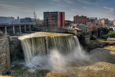
I have been following a few practioners of HDR/Tone Mapping with interest. Larry Lynch (sneaking up to 7 decades - as he puts it) is one such photographer. Larry does not have a website (that I am aware of). His body of HDR photographs is small and seems to be in the fledgling-work-in-progress stage.

Nevertheless, he has been posting HDR photographs on NPN and several have caught my attention and piqued my interest.

My interest in HDR is twofold: #1fold - as a landscape photographer who is NOT 
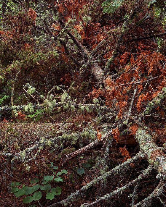
addicted to the light (i.e. soft warm earlyAM/EarlyPM), I photograph whenever and sometimes that means hard/harsh direct sinlight that is a contrast/dynamic range challenge for both sensors and film. HDR/Tone Mapping addresses this problem directly. #2fold - While most of the HDR photographs I have seen to date are way overbaked, it nevertheless seems, in the hands of a "sensitive" photographer, capable of creating photographs which I would label "hyper" real.

I use the word "hyper" because, frankly, at this stage of the photographic game we're just not acclimated to viewing photographs with such an extended dynamic range throughout the entire photograph (as opossed to photographs with GNDed skies over realatively full-ish range foregrounds). The viual effect can be quite disconcerting, and to my eye and sensibilities, interesting/intriguing as well.

Here's a link to Larry's photographs on NPN. I don't know if it will link directly or ask you to sign in/ register//whatever (will someone please let me know). Pay particular attention to Busy, Busy, Busy, Rare Morning, A Fall Image...(another version), and A Canopy of Color.

A Canopy of Color is as "natural" a photographic rending of a high contrast scene as I have ever seen.However it exhibits less of the "hyper" reality than I find in the other mentioned photographs.

What do you think?

Learn more about HDR/tone Mapping here. Be sure to check out the "View examples" page. You can also download a free full featured version of Photomatix - an HDR/Tone Mapping program.

FEATURED COMMENT: Joel Truckenbrod wrote: "The problem that I generally have with HDR, especially when it is used in a "heavy" fashion (such as it is here), is that to my eye, it denies what I hold to be the true power of the medium - some greater, objective relationship to perceived reality. The "hyper-real" aspect of the technique doesn't translate for me. Rather, I find myself lost as to what I'm supposed to be getting from the image. I see some connection to the seemingly never-ending desire for many photographers to actually be painters."

Tuesday, November 07, 2006

ku # 437


Urban landscapes of the postmodern kind most often connote a sense of coolness and alienation. And deservedly so - modern urban architecture and environments tend to reflect the corporatization of American life - sterile, efficient, no-nonsense, and bottom line/to-the-point. The fact that modern buildings devoted to commerce are also "secure" and, in effect, "gated" creates a moated-fortress mental wall that is very emotionally islolating.

Amazingly, at least to me, is the fact that, for the spend-and-get worker-drones, the beat just goes on (seemlily unquestioned and/or, worse yet, un-noticed), and on, and on....

Jim Jirka ~ Choaticism Continues


There are few times when I am out making an image, that a view just excites me when I see it on the ground glass. It is even more of an excitement when the vision continues into print form.

This is one such image. It is in my continuing body of work, depicting the explosion of chaotic detail, while still having a semblance of order.

Nuances of color and shape help define an almost camouflaged story.

Publisher's Comment The devil made me do it - I didn't seem to have any choice but to post this immediately following Timothy Atherton"s Immersive Landscape

FEATURED COMMENT #1: Michelle Parent wrote: "This shows exactly why you are drawn to Tim's! You and he are on the same wavelength! There's a painterly quality to your's that I like, but it may be the compression too. I really like that you use color here, because it is what helps define the basic shapes and areas in this. I am not sure it would be as strong in B&W. Very lovely! The dark spikes of goldenrod (?) really draw me in. There is a gentleness/tenderness here that I feel. A respect for the passing of the season. A quiet observation that YOU are NOTICING that these INDIVIDUAL lives are ending AT THIS MOMENT."

FEATURED COMMENT #2: Paul Raphaelson wrote: ""...I do think work of this kind is evidence of the importance of a body of work over an individual image. We are all drawn to this picture as a particularly nice example of a certain KIND of image that has become welcoming and familiar. But beyond certain surface details, we have no way of knowing what distinguishes Jim's vision from that of any number of other people.

This isn't a criticism of Jim or of this image; just an observation on the limitations of a single image in conveying what an artist cares about.

Picture #2 in this body of work could be almost identical to this one; it could be a picture of a suburban living room with a similar color scheme; it could the bloody legs of a corpse in the grass ...

All might be plausible, but the meaning of this image is greatly altered in each case.
"

Timothy Atherton ~ Immersive Landscapes


A bit of Finnegans Wake where Joyce is playing with the influence of Beckett as well as with words:

"...the farther back we manage to wiggle the more we need the loan of a lens to see as much as the hen saw. Tip. You is feeling like you was lost in the bush, boy? You says: It is a puling sample jungle of woods. You most shouts out: Bethicket me for a stump of a beech if I have the poultriest notions what the farest he all means. Gee up, girly! The quad gospellers may own the targum but any of the Zingari shoolerim may pick a peck of kindlings yet from the sack of auld hensyne."

It somehow speaks to what I am trying to do, even while I still don't quite grasp it....! The idea of "bethicketted"

Growing up beside tidal marshland on the English Channel I was always drawn more to the salt marshes with their low surrounding scrub and wind battered trees and to small dense moorland copses rather than to the big ancient forests of Britain. And so northern boreal forest has a familiar echo with its low, thick, dense, tangled scrub that resonates with something ancient.

But to try and impose order on this messy and unordered view seemed a mistake. I found I enjoyed the aparent the disorder, the fine detail spread over the whole image and allowing the eye to wander over the whole field without finding a clear point of rest.


The trees lack height and substance. There are no massive oaks or giant redwoods to anchor the forest either physically or visually - no forest canopy - and the northern forest lacks a dark dense forest floor. Instead the harsh oblique summer sunlight angles through and reaches all but its deepest parts giving areas of strong shadow and highlight. The results are what I’ve come to call "immersive" landscapes where the whole wide image is provides lots of smaller and hopefully interesting subplots over and against the overall story that the picture is telling.

See more Bethicketted

FEATURED COMMENT: Jim Jirka wrote: "I really do not know why I am so drawn to this type of image. ??? Oh yes I do. ;-)" - please see Jim's photograph above.

And, Jim, please tell us "why (you) are so drawn to this type of image..."

Monday, November 06, 2006

ku # 436 ~ sort of an anti-ku # 434


Grey day, grey place. Old Montreal is one of the grey-est places I have ever been. Built entirely of stone in the late 1600s/early 1700s, the streets are narrow and the feeling is very canyon-like. The stone, not an element that I would normally consider to be "warm", actually does provide a warm feeling in this urban landscape, especially when experienced against the backdrop of modern glass and steel urban structures. The fact that the streets and buildings are drenched in a palatable ambience of history helps humanize the place as well. Everything is on a very human-friendly scale. For instance, the narrow streets dominate the traffic (demanding a slow pace), the traffic does not dominate the streets.

To my mind, the "anti-ku # 434"-ness of this photograph is twofold - 1. the denoted lack of color, and, 2. the subsequent connoted sense of urban estrangement. Although, it must be said that item # 2 is called into question by the preceding paragraph, thus demanding consideration of the realtionship between photographs and words.

Can a photograph stand alone and be succesful in the realm of the connoted (equivalence)? Does the oft-stated admonition that a photograph which "needs" words is a "failure" - because it's a visual medium (as the caveat always goes) - have any validity?

ku # 434


Late fall color in an urban landscape. Sunday morning view - 11/05/06 - from our room in old Montreal.That's the St. Lawrence River in the background. Since this is about 60 crow-flying-miles north of the now leaf-less Adirondack Mts. where we live, it was surprising to find trees full of leaves in full fall color.

FEATURED COMMENT #1: Darwin Wiggett wrote: "I really like the division of the frame into halves with one half inside, the other the outside world - like the divisions in many modern human's existance. The lone figure reminds me of the alienation of people in the urban landscape where we are surrounded by people everywhere but where we are isolated. I also loike the contrast between the briallance of nature and the greys of the urban landscape."

Thanks Darwin. Glad to see you hanging around the joint. Still waiting for that first photo submission.

Photography Directory by PhotoLinks